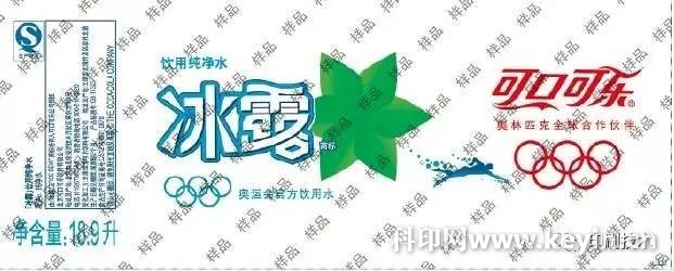
Magnificent, under the traditional Chinese people's aesthetic standards, it will definitely score full marks. Nowadays, the style of simplicity has gradually penetrated people's minds, and the product packaging is also the same. In short, the simpler and softer packaging design with simpler design, more distinct theme and more unique ideas should be a major direction for future development. Today Xiaobian bring several PepsiCo products for everyone to see packaging services for international companies PepsiCo Shanghai Purple Springs labels how to say. Design Principles Visually able to accurately convey product information, such as the product's LOGO, trademark, net content and other information as the main body of design, generally ensure that consumers can clearly identify product information within a distance of 1 ~ 4m, and if the packaging and decoration design is excessively dazzling , it is easy to "take the lead"; In the packaging design , we should try to avoid the aesthetics of the level by increasing the amount of ink, but we should try to reflect the change of the color of the design pattern through the smooth transition of the tone, so as to reflect the soft beauty of the color; Try to reduce the number of colors, otherwise, it will not only increase the actual cost of packaging products and printing difficulty, but also print repeatability. Case analysis Let's take 3 OPP tags as an example to talk about how to simplify the design of flexible packaging. Figure 1 shows the MPR label of the Midaida, which is printed in 10 colors. The base color is thick and red, and the ink consumption per unit area is large. The "net content" is 3 characters and the theme "Umei flavor" is 3 words. Pink, the fonts of these colors are not prominent in the red background. Figure 2 shows the Pepsi-Cola OPP label, which is printed in 6 colors. The entire layout is dominated by the mesh, which makes full use of the dot changes to achieve color gradient and multi-level effects. Figure 3 shows the Coca-Cola ice dew OPP label, which has a simple print design. The design style of the mesh and the lines highlights the Pepsi brand, and there is no large-scale field. Analysis of the decoration design features of the above three OPP labels: From the printing point of view, in order to improve the visual impact, the Mido OPP label is mainly based on large-area solid printing, and uses more colors, not only printing is difficult, Some of the themes are not prominent, and they are an over-printing. This is the method commonly used in China's label decoration design. The Pepsi-Cola OPP label is mainly based on the mesh, the printing is less difficult, the theme is eye-catching, and the ink is on the unit area. The amount is only 45% of the label shown in Figure 1. The Coca-Cola Ice Dew OPP label brings the concept of simple decoration design to the extreme, with minimal ink consumption, and the amount of ink per unit area is only 30% of the label shown in Figure 1. . Therefore, the design method of the label shown in Figures 2 to 3 is worth recommending. In addition, in the decoration design, we must also consider the packaging effect, safety, environmental protection, easy recycling and other factors of the printing materials, try to use a single material. (The author of this article worked at Shanghai Ziquan Label Co., Ltd.) For more exciting, please pay attention to the "Printing Technology" official WeChat (Printech1957). Ningbo XISXI E-commerce Co., Ltd , https://www.petspetsdoggze.com Figure 1 Mei Nin OPP label
  Figure 2 Pepsi-Cola OPP label
  Figure 3 Coca-Cola Ice Dew OPP Label
  Scan the QR code to follow the official "WeChat" printing technology
The price of the film rose, listen to the Shanghai Ziquan label how to say
BAIDU_CLB_fillSlot("879457");